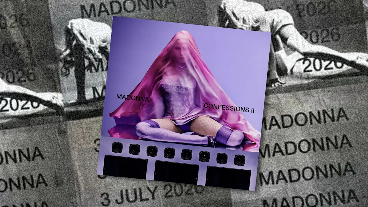
Madonna's announcement of Confessions on a Dance Floor II signals a return to the club, but its visual identity suggests something more deliberate than nostalgia. Rather than reprising the pink-hued disco aesthetic of the 2005 original, the campaign leans into high-contrast, sans-serif typography and a design language rooted in digital minimalism. The creative agency behind the rollout is the same team responsible for the visual identity of Charli XCX's brat — a project whose stark, lime-green branding became one of the most discussed design artifacts of the past two years.
The partnership is notable not just for what it produces, but for what it signals about how legacy artists approach visual reinvention. Madonna, whose career has been defined by serial image transformation, is now drawing from a design vocabulary that emerged outside the traditional pop-star apparatus — one shaped by meme culture, social-first rollouts, and the deliberate rejection of polish.
Helvetica as Statement
The campaign's typographic backbone is Helvetica, the Swiss-designed typeface that has served as a default of institutional clarity since the mid-twentieth century. In the context of pop music marketing, where custom lettering and elaborate visual worlds are the norm, the choice reads as a provocation. Helvetica carries no decorative intent. It communicates efficiency, neutrality, authority — qualities not typically associated with a dance-pop album launch.
The rollout extends this logic across a diverse "font book" of sans-serif typefaces, where text is stretched, outlined, and flashed across social media in a strobe-like rhythm. Wheat-paste posters and short-form video clips transform release information into aesthetic events in their own right. Typography becomes the spectacle, not the supplement. The central "M" logo — depicting the singer's legs in silver boots framed by a speaker — provides a rare moment of figurative imagery in an otherwise text-heavy landscape, functioning almost as a glyph within the broader typographic system.
This approach has precedent. The brat campaign demonstrated that a single color and a single typeface, deployed with consistency and confidence, could generate cultural resonance that rivaled any high-budget visual production. The lesson was not lost on the broader industry: restraint, executed with precision, can cut through the noise of an oversaturated media environment more effectively than maximalism.
Reformatting Legacy for a Faster Visual Culture
Musically, the album reunites Madonna with producer Stuart Price, the architect of the original record's disco-inflected sound. The sonic continuity makes the visual departure all the more striking. Where the first Confessions wrapped itself in the warm glow of late-seventies disco revivalism — mirror balls, leotards, saturated color — the sequel's branding operates in a cooler register, one calibrated for the scroll speed of contemporary platforms.
The distinction matters because it reflects a broader tension in how established artists navigate relevance. One path is retrospection: reissues, anniversary tours, visual callbacks that reward long-time fans. The other is adaptation — absorbing the design codes of a younger cultural moment and deploying them with the institutional weight that only a decades-long career can provide. Madonna appears to be pursuing the latter, treating her own catalog not as a museum piece but as raw material for recontextualization.
Whether this typographic austerity translates into sustained cultural traction remains an open question. The brat aesthetic worked in part because it emerged from an artist whose audience was already native to the platforms where the design language circulated. Madonna's audience spans multiple generations and media ecosystems. The risk is that minimalism reads as cool detachment to one cohort and as unfamiliar austerity to another. The reward, if it lands, is a demonstration that visual reinvention at this scale need not depend on spectacle — that the right typeface, deployed with enough conviction, can function as its own kind of provocation.
With reporting from Fast Company Design.
Source · Fast Company Design