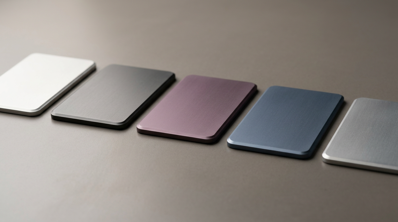
The industrial design of the iPhone has long been a study in iterative refinement, where minor shifts in texture and hue serve as the primary visual cues for generational progress. Though the iPhone 18 Pro is not slated for release until September 2026, the early machinery of the rumor mill has already begun to turn, focusing specifically on the device's aesthetic identity. Recent leaks suggest that Apple is moving away from the more predictable ends of the spectrum, exploring a new "signature" color that departs from both the vibrant orange some had speculated about and the stark, deep black that others anticipated.
The pattern is familiar. Each iPhone generation since the introduction of the iPhone 5c in 2013 has used color as a narrative device — a way to mark the passage of time in a product line where the underlying slab of glass and metal changes only incrementally from year to year. The gold iPhone 5s signaled Apple's pivot toward luxury positioning. The midnight green of the iPhone 11 Pro marked the company's first serious experiment with muted, fashion-forward tones on a flagship device. More recently, the titanium finishes introduced with the iPhone 15 Pro line leaned into materials science as much as color theory, tying the visual identity of the device to its structural composition.
Color as Strategy in a Maturing Market
The smartphone industry has entered a phase where raw performance gains are difficult for most consumers to perceive. Processors are fast enough. Cameras are good enough. Battery life, while still a point of contention, improves in modest increments. In this environment, the sensory dimensions of a device — its weight, its texture, the way light plays across its surface — carry disproportionate weight in purchase decisions, particularly at the premium end of the market.
Apple understands this dynamic well. The company's supply chain decisions around color are made years in advance, involving coordination with materials suppliers, anodization and coating specialists, and the marketing teams responsible for translating a hex code into a lifestyle aspiration. A signature color is not merely a finish applied to a chassis; it is a signal embedded in advertising, retail displays, and the social currency of unboxing content. When Apple selects a new tone for its Pro line, it is making a bet on which aesthetic will resonate across dozens of global markets simultaneously.
The competitive landscape reinforces this approach. Samsung's recent Galaxy S series has leaned into titanium colorways of its own, while Google's Pixel line has consistently used distinctive, sometimes polarizing hues — hazel, porcelain, obsidian — to carve out shelf presence. In a market where hardware differentiation is narrowing, color becomes one of the few axes along which brands can assert visual identity without altering the fundamental form factor.
The Limits of Leaks and the Logic of Anticipation
It is worth noting how early these reports surface relative to the product's expected launch. With more than five months separating the current leaks from a probable September announcement, the information available is necessarily incomplete and filtered through a supply chain where even minor details can be distorted in transmission. Apple's history includes deliberate misdirection and last-stage design changes that have rendered pre-release color predictions inaccurate.
Still, the cadence of these leaks serves a purpose beyond prediction. It sustains attention for a product category that might otherwise fade from public discourse between annual launch events. The speculation itself becomes part of the marketing apparatus — not orchestrated by Apple, but not unwelcome either. Each rumor cycle reinforces the idea that the next iPhone will be meaningfully different from the last, even when the differences amount to a few shifted nanometers on the visible light spectrum.
The deeper question is whether color strategy can continue to carry the weight Apple places on it. As upgrade cycles lengthen and consumers hold devices for three or four years, the annual refresh of finishes may lose its pull. Alternatively, it may become even more important: in a world where the phone in a person's hand is one of the most visible consumer signals they carry, the difference between last year's blue and this year's unnamed hue may matter more than any benchmark ever could.
With reporting from t3n.
Source · t3n