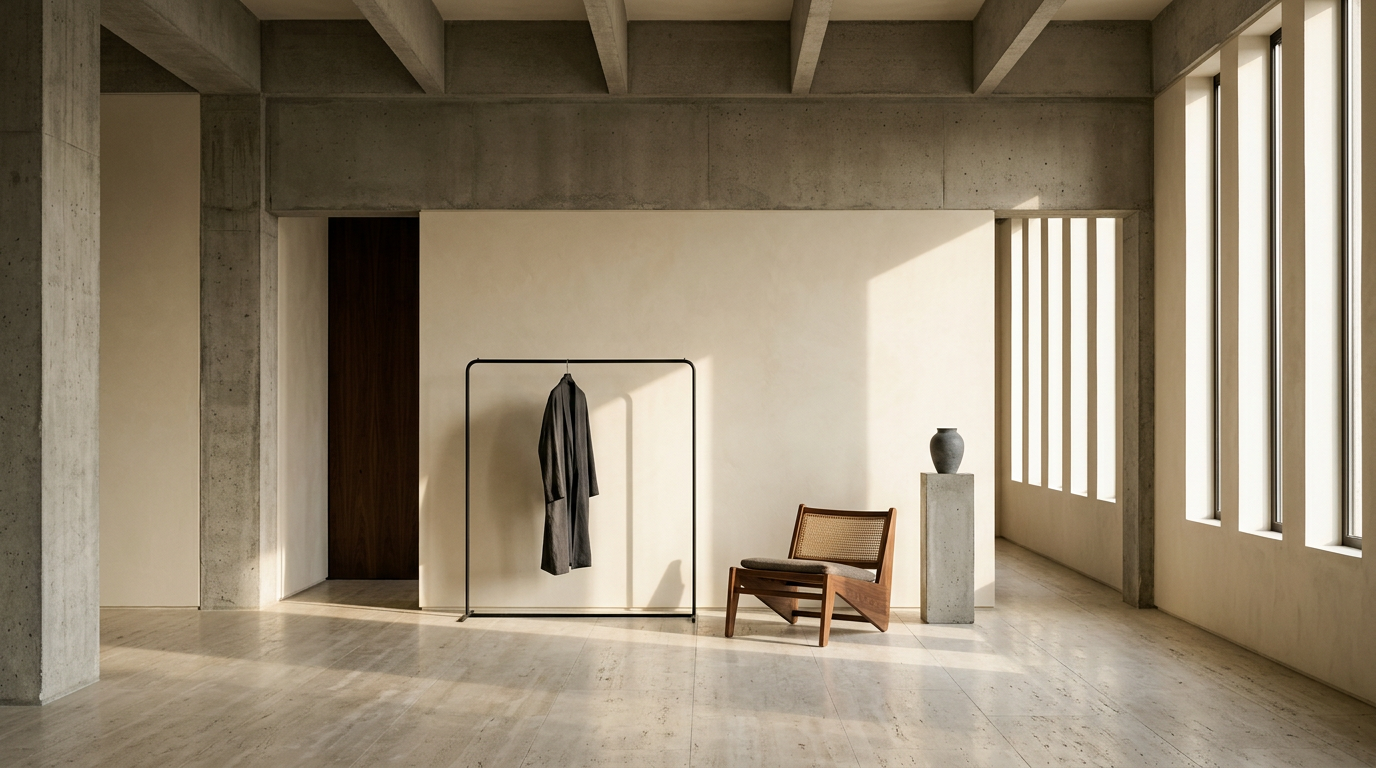
In Berlin's Kreuzberg district, a bakery interior has become a quiet argument about how design can reframe a quotidian craft. KEIT Bakery, designed by Studio Michael Burman, opens not with the rustic clutter typical of artisanal bread shops but with a single, commanding gesture: a curved counter assembled from three segments of a reclaimed millstone, fanned out and set atop a base of solid Douglas fir. The space treats baking less as a retail category and more as a sculptural performance — one in which every material choice carries legible intent.
The millstone, with its dense, pitted surface, is the gravitational center of the room. Reclaimed from a prior life of grinding grain, it introduces a weight that is both physical and associative, connecting the act of selling bread to the longer industrial history of milling. The Douglas fir base softens that mass with a warm, linear grain, while stainless-steel extensions integrate storage and workspace into a single continuous counter. Customers move along this line in a directed flow, and the mechanics of the bakery — shelving, preparation surfaces, display — remain visible rather than concealed.
Legibility as a Design Principle
The interior's organizing logic is legibility. Bread loaves sit on thin stainless-steel shelves whose industrial sharpness contrasts with the irregular, organic forms of the crusts. Washi paper, a handmade Japanese material traditionally associated with screens and calligraphy, appears as a diffusing layer in the lighting, lending a soft, even glow that avoids the theatrical spotlighting common in retail food environments. Nothing in the space is decorative in the conventional sense; each surface and fixture exists to clarify how things are made and how they arrive in front of the customer.
This approach places KEIT within a broader current in European retail design that has been gaining definition over the past decade. Bakeries, coffee roasters, and natural-wine bars — particularly in cities like Berlin, Copenhagen, and Amsterdam — have increasingly adopted interiors that borrow from gallery and workshop aesthetics. The aim is to strip away the semiotic noise of branding and let material and process speak. Studio Michael Burman's work here is a disciplined example of that tendency, though it pushes further than most by making the counter itself, rather than the product or the brand identity, the primary architectural event.
Kreuzberg, historically one of Berlin's most culturally layered neighborhoods, provides a fitting context. The district's built environment is a palimpsest of prewar tenements, postwar social housing, and successive waves of subcultural adaptation. A bakery interior that foregrounds reclaimed industrial stone and unfinished timber reads differently here than it would in a newly developed commercial district — it participates in Kreuzberg's long tradition of repurposing the material residue of earlier economies.
Craft, Visibility, and the Retail Interior
The decision to keep the bakery's working processes visible is not merely aesthetic. In food retail, transparency has become a proxy for trust. Open kitchens, visible fermentation vessels, and unpackaged display all signal an alignment with craft values that consumers in this market segment have come to expect. KEIT's design formalizes that expectation architecturally: the counter is not a barrier between maker and buyer but a shared surface along which the transaction unfolds.
What remains to be seen is whether this level of material restraint can sustain a commercial identity over time. Minimalist retail interiors risk becoming interchangeable — a hazard well documented in the so-called "global coffee shop" aesthetic that homogenized café design across cities in the mid-2010s. KEIT's specificity lies in the millstone, an object with enough physical presence and biographical weight to resist easy replication. Whether that singularity is enough to anchor a lasting identity, or whether it becomes another reference point in an increasingly crowded field of craft-forward retail design, is a tension the project does not resolve so much as embody.
With reporting from Designboom.
Source · Designboom